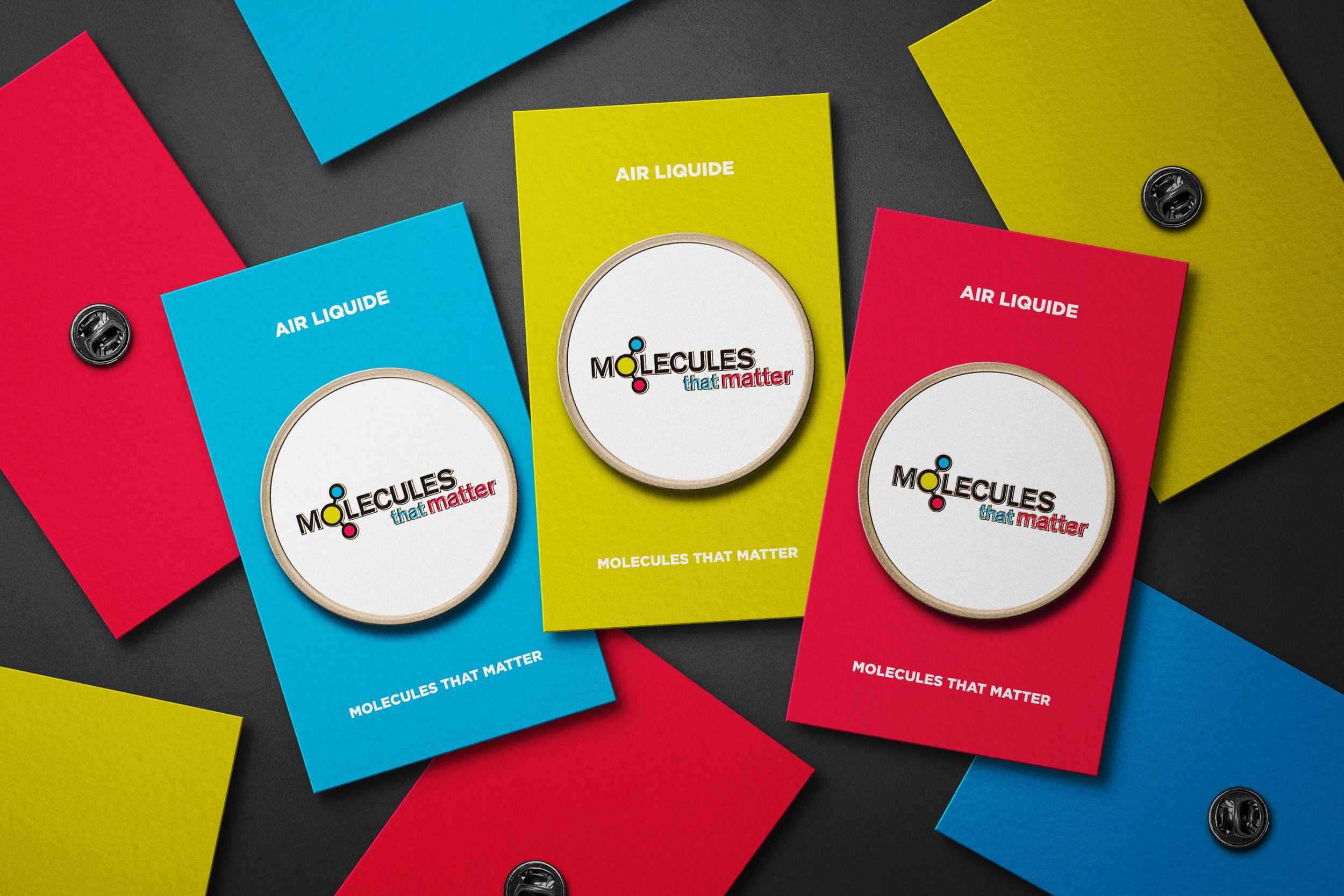
A geometric sans serif typeface was selected to utilize the round letter shape of the "O". We surrounded the letterform with two smaller atoms to illustrate a molecule. Air Liquide's color palette was then integrated to complete the logo design.
19 of Forty
Designed at MSD | GDUSA Award Winner 2009


